Optimal Resourcing
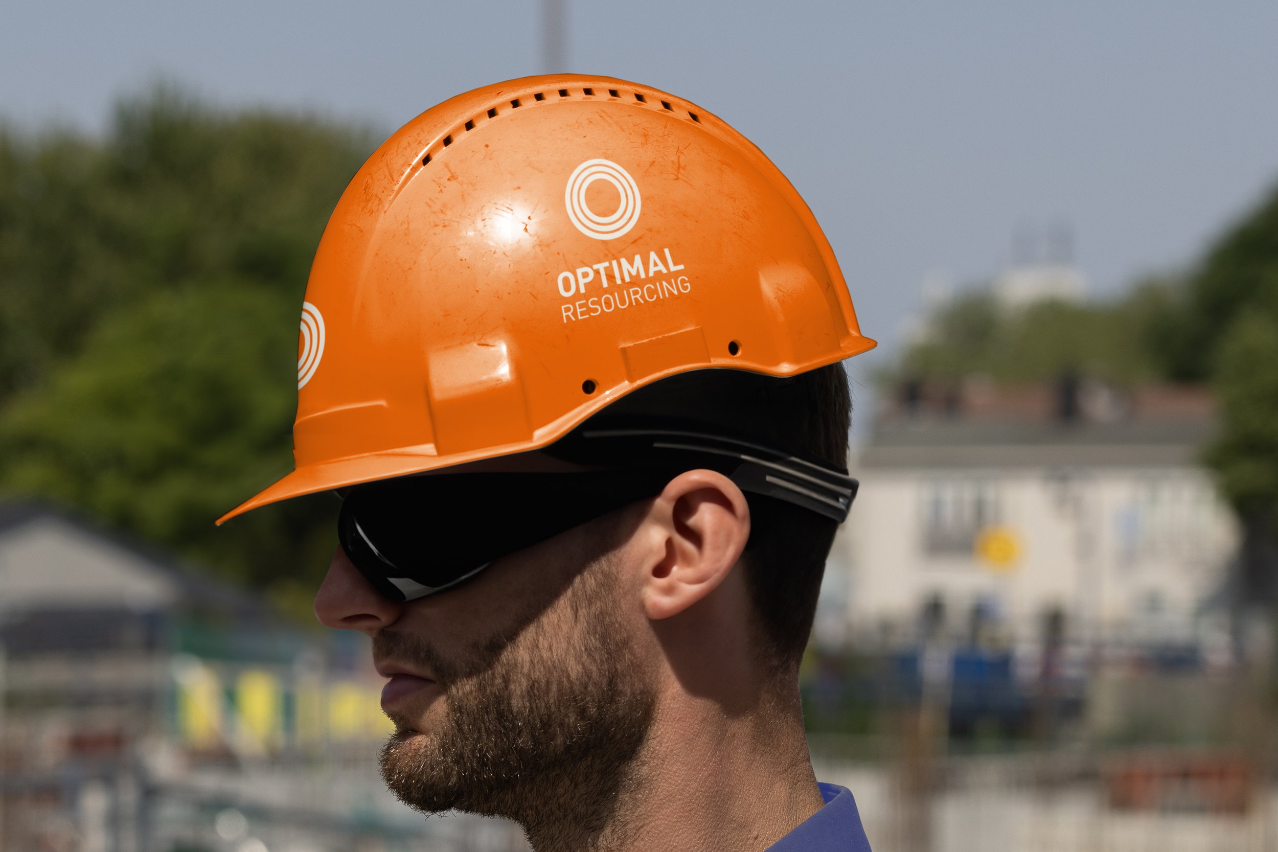
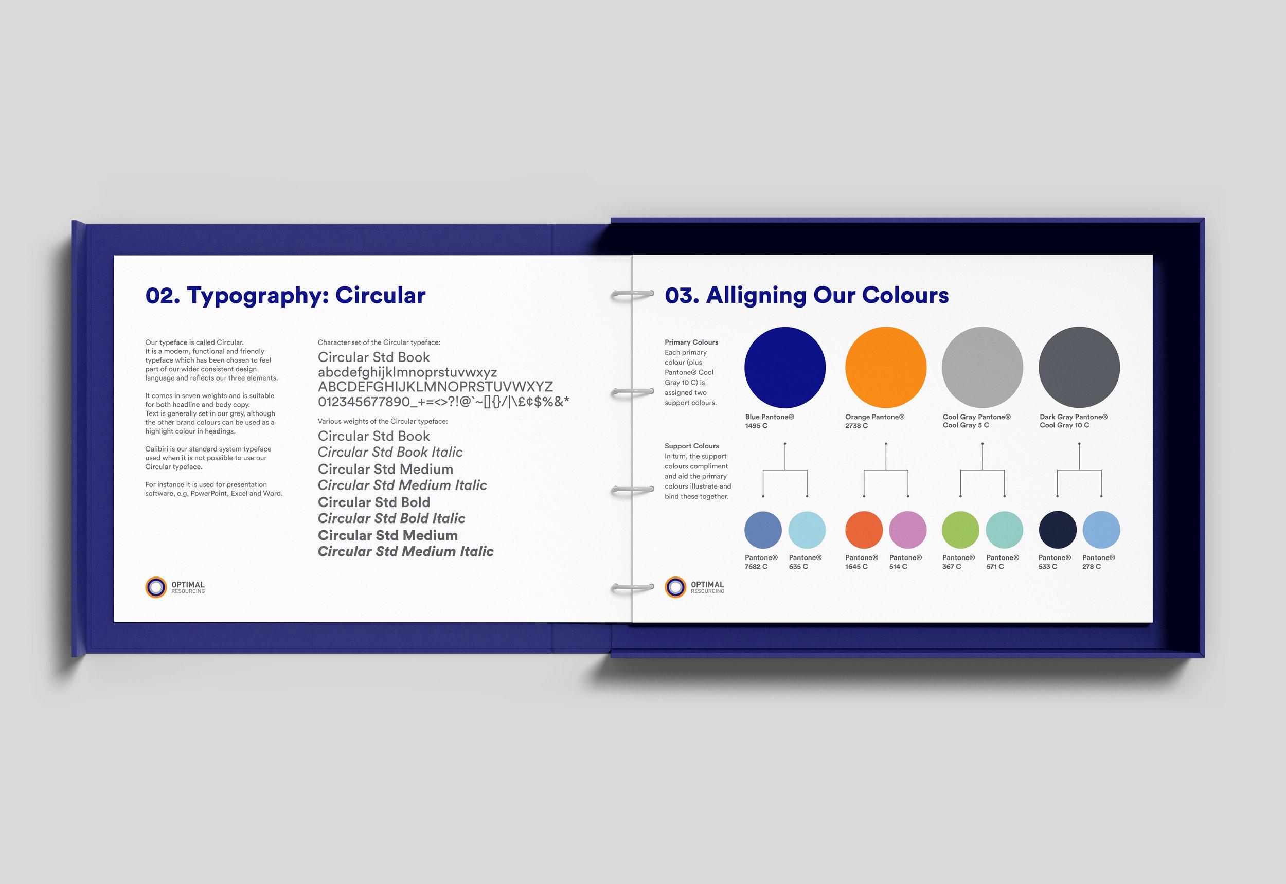
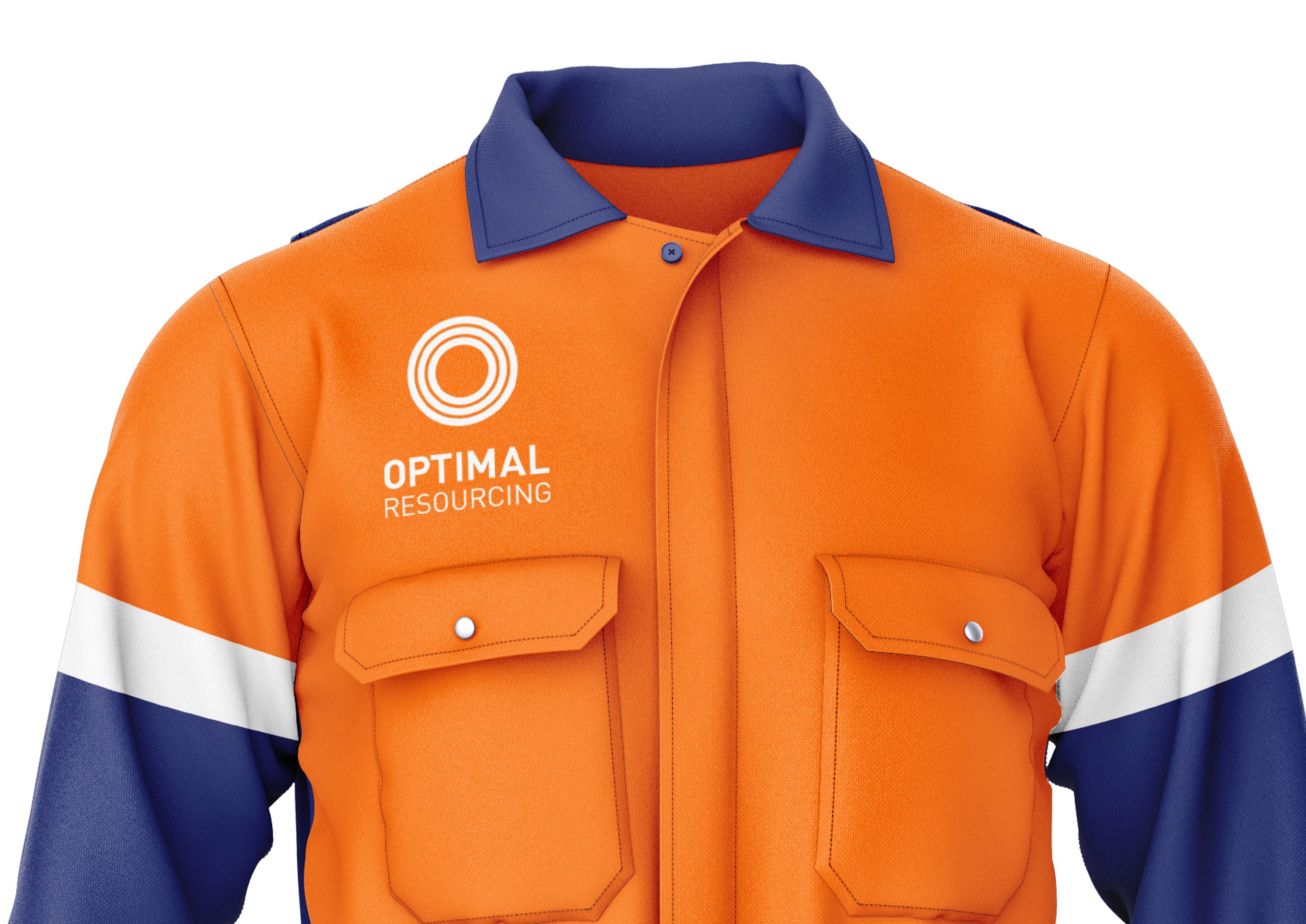
Brand identity for Optimal Resourcing, mining, construction and shipping resourcing and recruitment agency in Perth, Australia. The rebrand is based on the three pillars of the business, which translated into three coloured circles to reflect ‘O’ for optimal and each area of the business specialises in. Orange to reflect mining and earth, Blue to represent sea shipping and the sea, and grey for construction. These three colours also represent (Right Work), transition (Right People) and stabilisation (Right Behaviours). The identity was created with in print and digital applications in mind. Brand guidelines were written to ensure consistency across the business, to improve and transform the organisations operating models and bottom line. This also included design of Powerpoint slides and stationery.


